The ask: Design a logo, business card, collateral and CI guide for a new brand.
The brand I created was called Envision Optometrists. I had the idea that a big E with a line below it would be the logo emblem that is reminiscent of the big first letter used in traditional optic eye test charts. I wanted this brand to feel modern and clean, trustworthy and true to science.
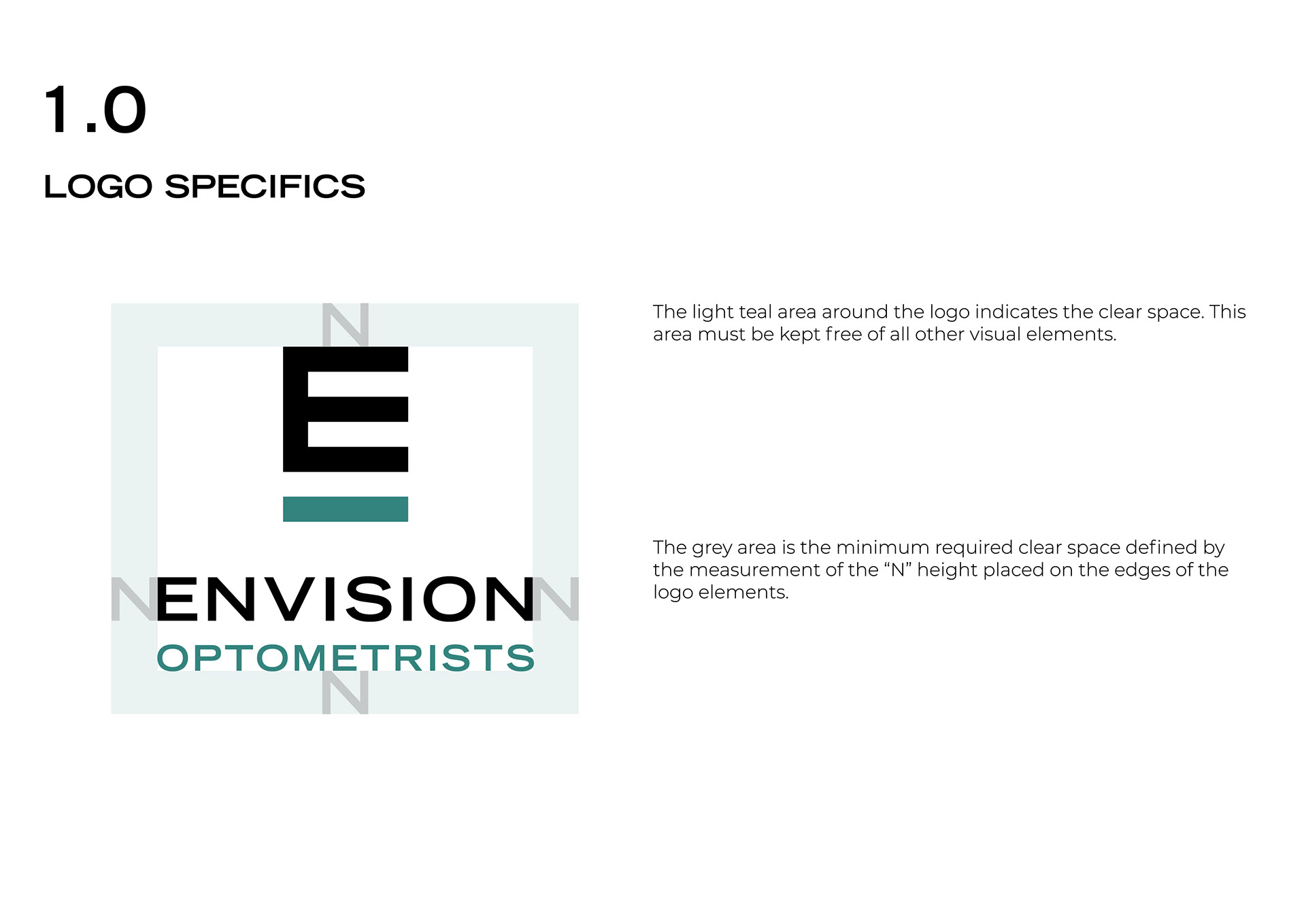
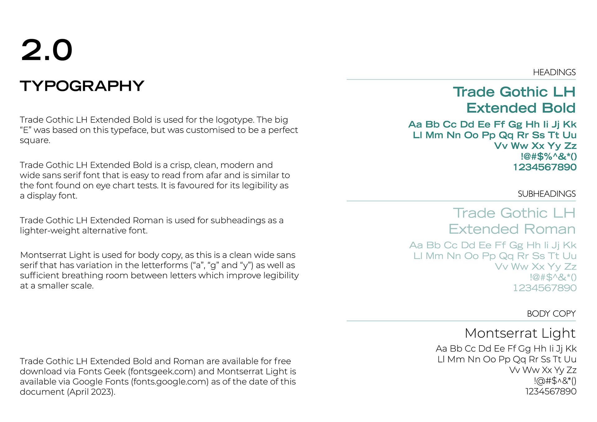
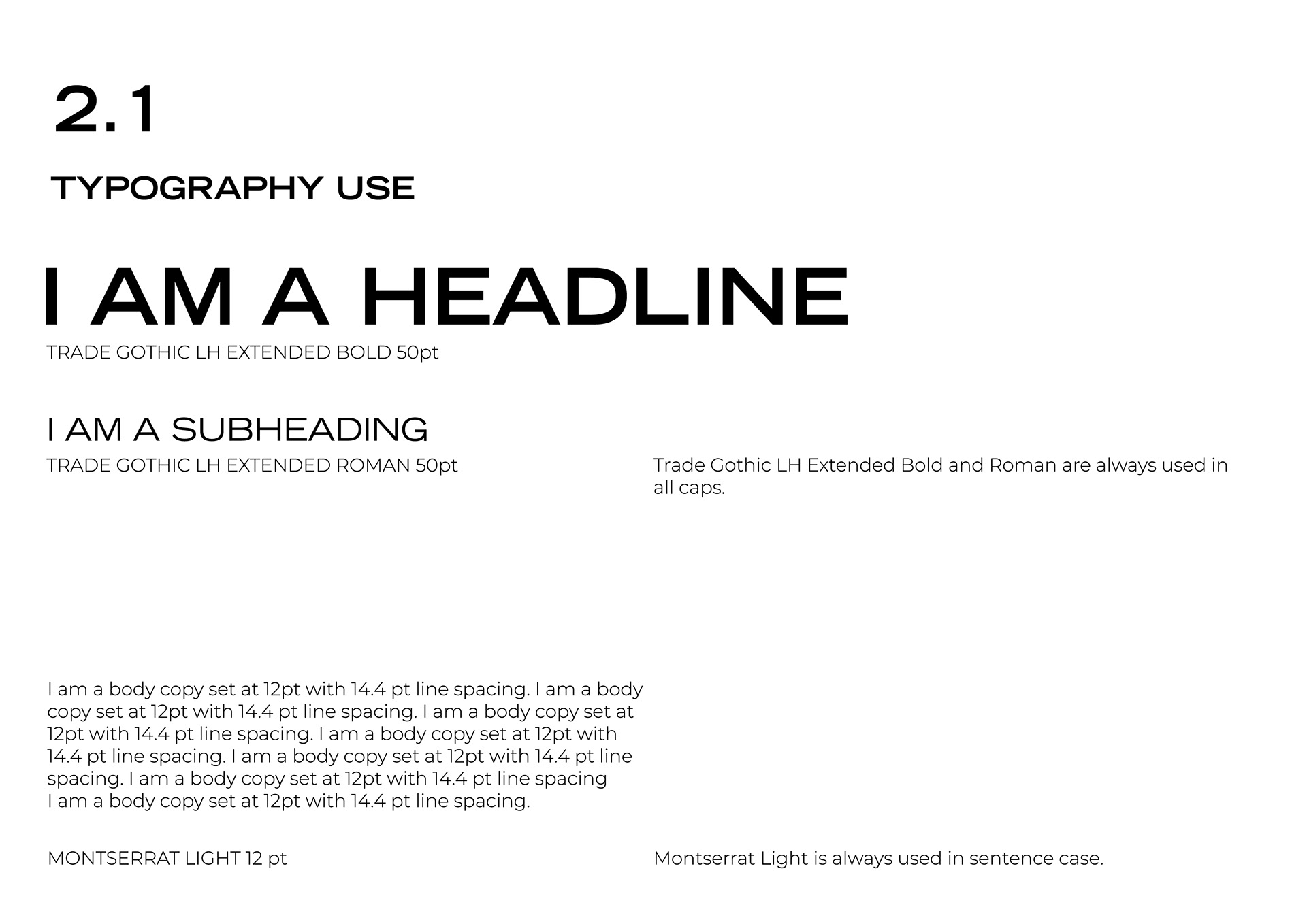
The logo design was Bauhaus inspired, which is a design style that is minimalistic and uses clean geometric shapes. Bauhaus design is seen as a universal design language and is utilised when the target audience is wide, which was the case for this brand. I made use of a clean-cut wide sans serif and gave the logo enough breathing room so that it can read at a small and large scale.
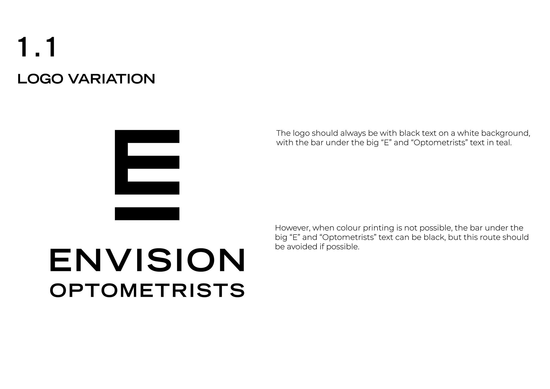
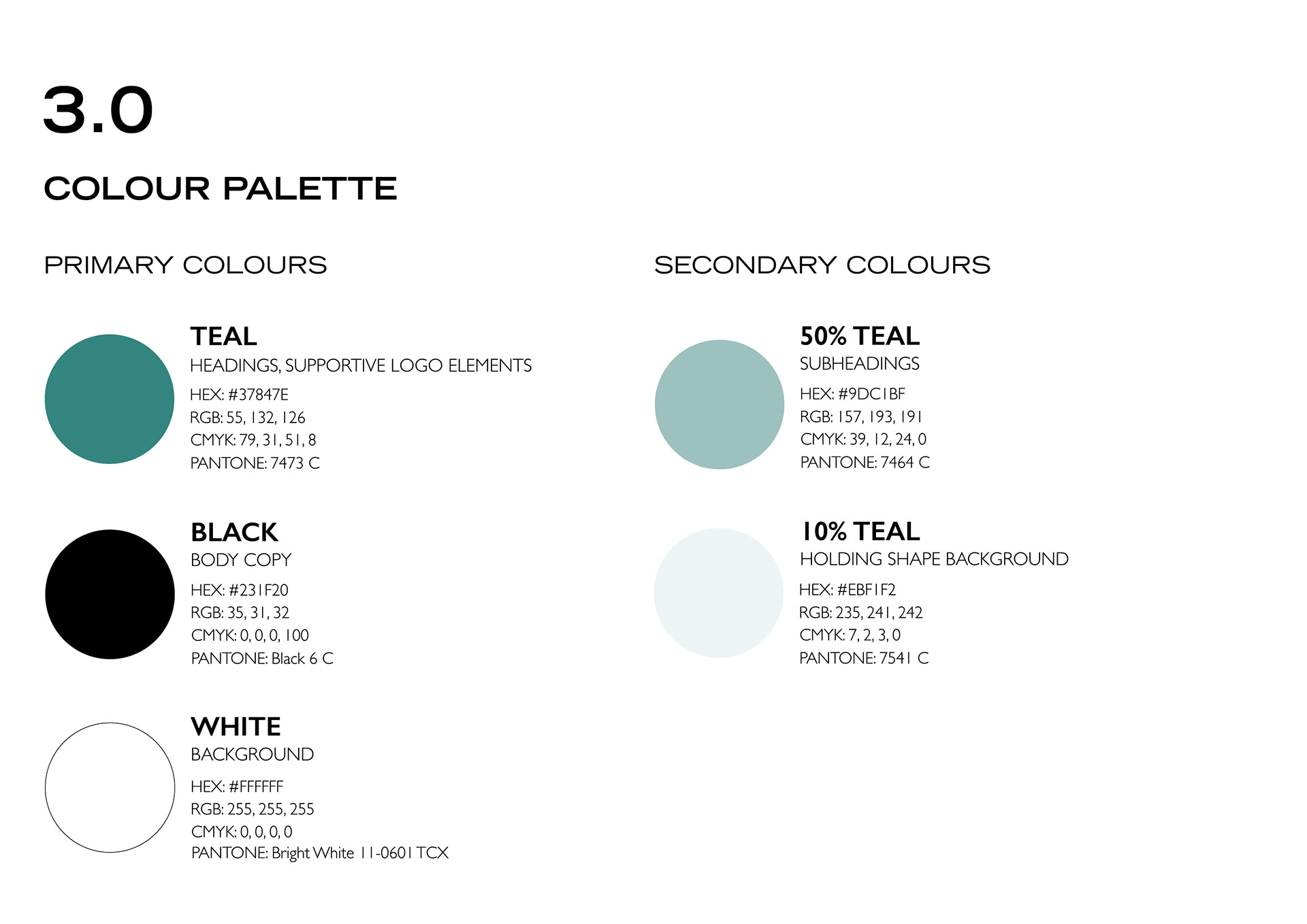
The colour palette was very limited with only three colours: black, white and teal. Using the Adobe Colour Accessibility Test, the colour palette was tested for contrast and visibility for people that are visually impaired or colourblind.
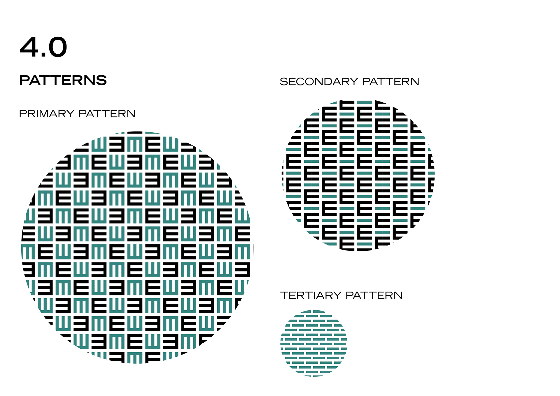
The collateral design patterns were created using the logo emblem with the "E" alone, the "E" and line combined, and the line alone. This created a continuous visual language while adding enough interest and variation to the patterns.
LOGO IDENTITY
BUSINESS CARD DESIGNS
GLASSES CASE COLLATERAL DESIGN
OFFICE LIVERY DESIGN
PRIMARY BRAND PATTERN
SECONDARY AND TERTIARY BRAND PATTERN
CORPORATE IDENTITY GUIDE
